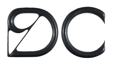
A branding project curated for Kocheria, a Swiss cooking school. The shared purpose was creating an identity that felt minimal, classy and elevated, with a pinch of fresh and edgy. Continua – an old-style typeface redrawn with a contemporary vision – looked like the perfect tool. Subsequently, the flame concept was added to the mix. The idea is literal, but also symbolic: it’s the flame used to cook your food, but it’s the flame that drives you to learn the art of cooking. By adding a strong B&W aesthetic, the visuals started recalling the old woodcut prints, but with the precision of our modern times.